Idea
To redesign an existing data story from the Hindu Data Point.
Background
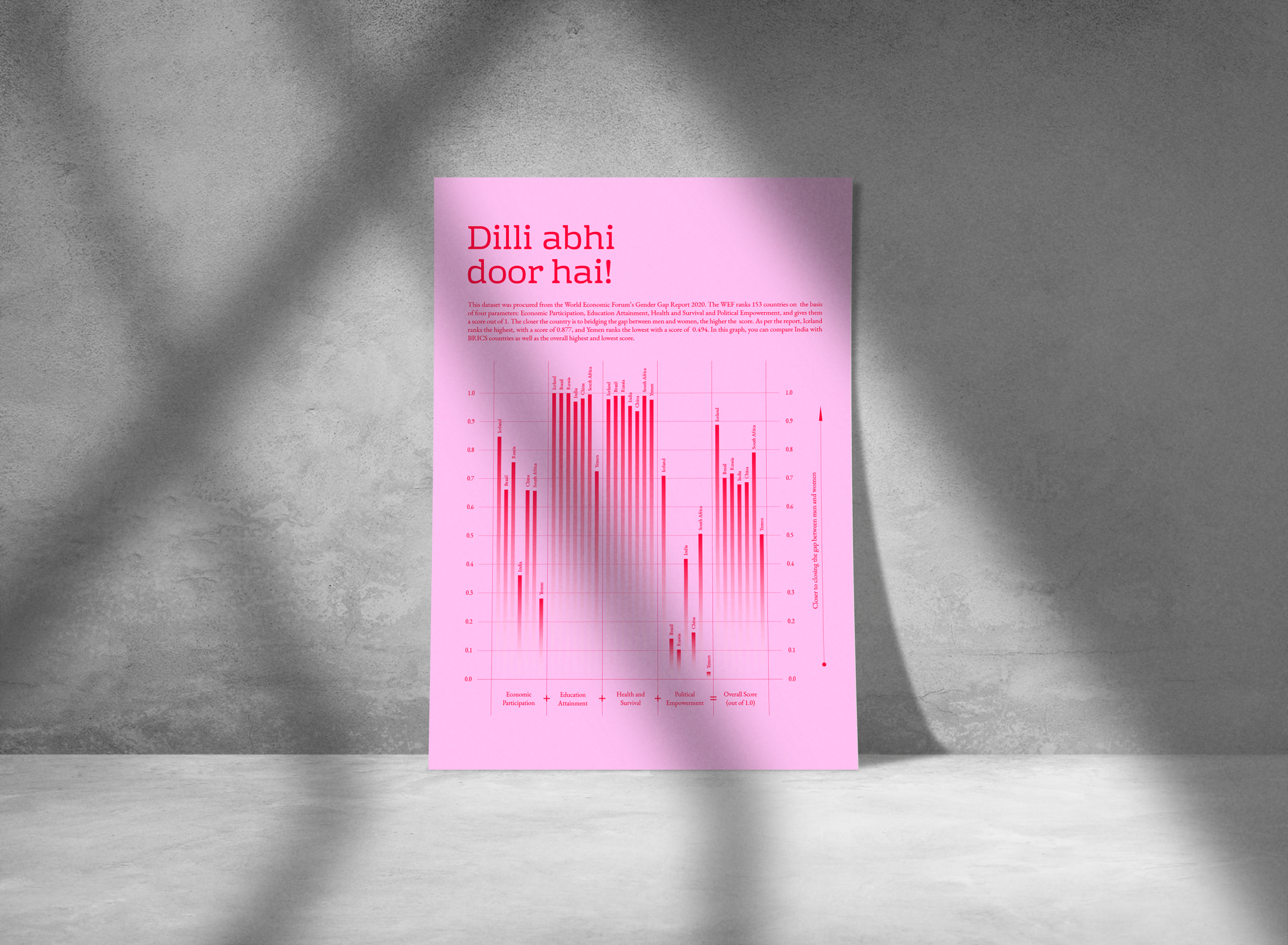
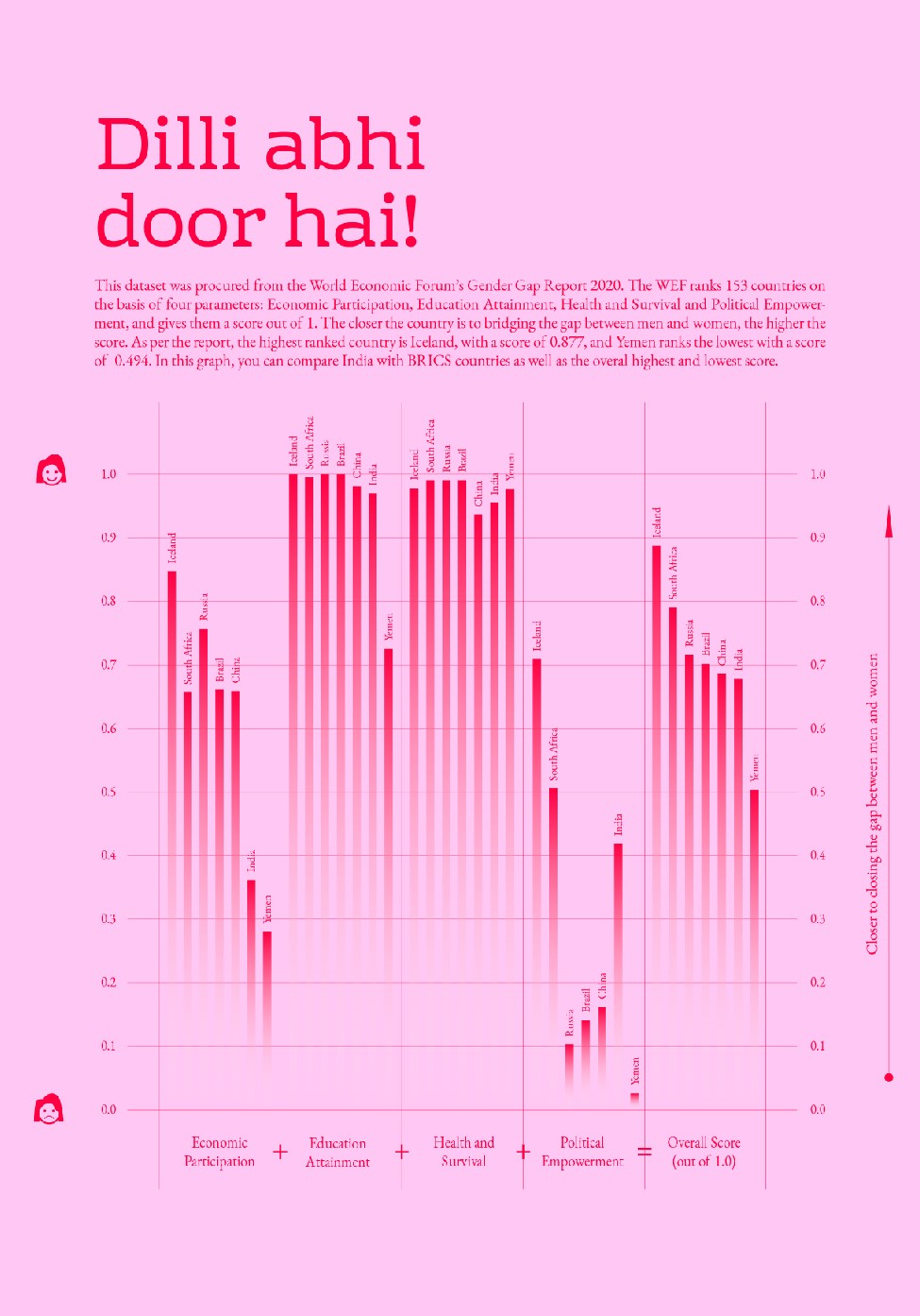
For this project, I redesigned the Hindu Data Point story about the World Economic Forum’s Gender Gap Index 2020. The story can be found here.
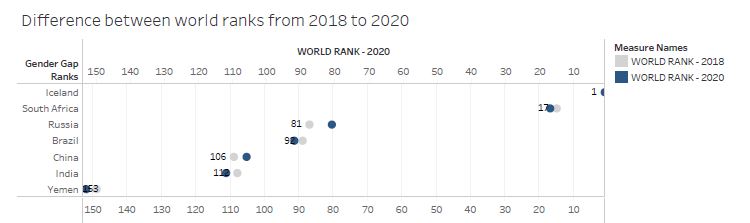
The WEF ranks 153 countries on the basis of four parameters: Economic Participation, Education Attainment, Health and Survival and Political Empowerment, and gives them a score out of 1. India is currently at the 112th spot.
The Hindu Data Point story, however, had shortcomings in the way they chose to represent the dataset.
Shortcomings
- The data does not compare the same set of countries in all four parameters.
- The scale is not uniform throughout the four parameters.
- There is no justification for using colours.
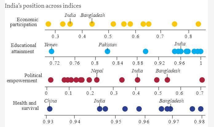
Redesign Ideas
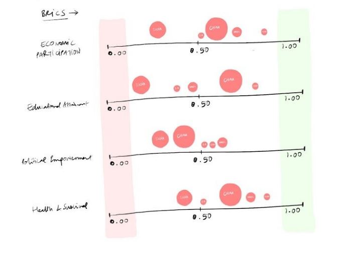
Inference from Ideation
- Showing the population of women of a country might deviate from the current story that is being told.
- Choosing BRICS Countries and the highest + lowest score would position India appropriately.
- Showing Before and After ranks might add extra data points that create a cognitive overload for the reader.
Final Output Draft
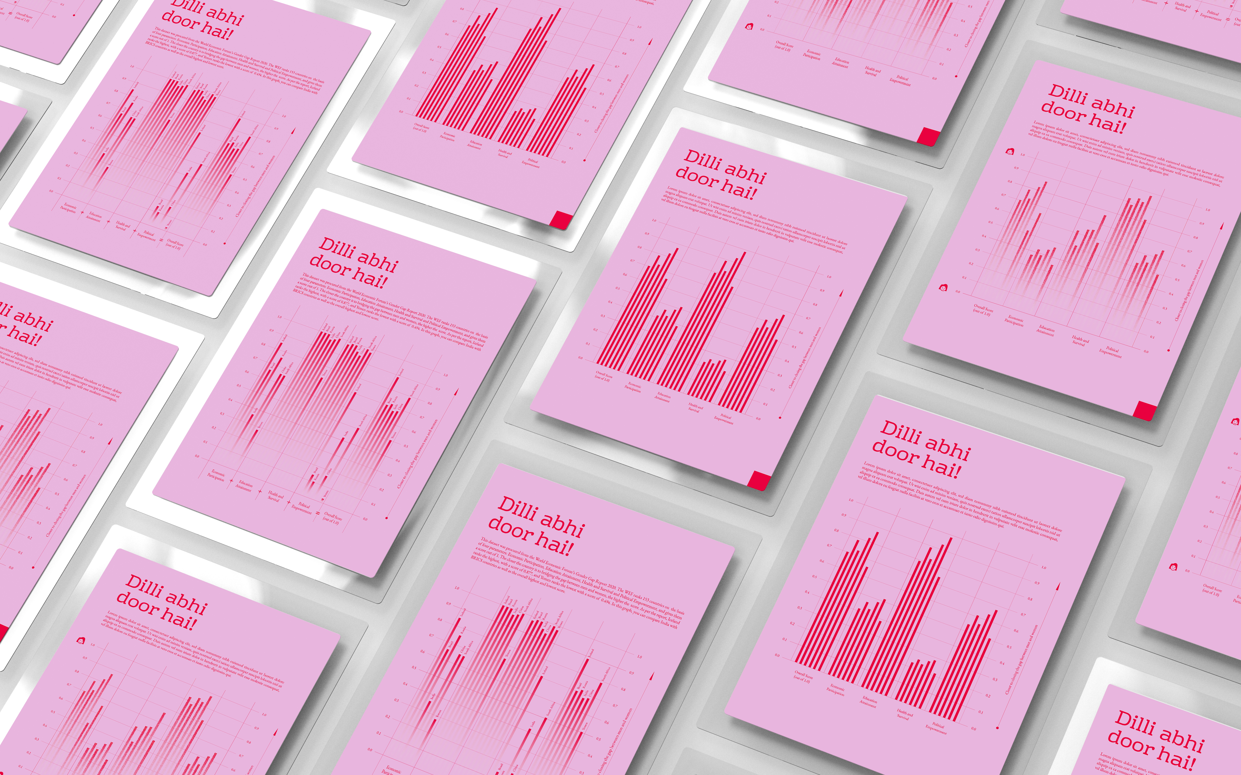
Final Output